Wednesday, 8 May 2013

Evaluation

Question 1. In what ways does your media product use, develop, or challenge forms and conventions of real media products?


I have adhered the codes and conventions you would expect to see inside a music magazine. I believe this will make my music magazine more successful as it is what the audience would expect to see from previous magazines they have read. I think the fluent colour scheme and ongoing story makes my magazine flow more therefore making it more professional and not look randomly placed. I think my overall magazine is quite sophisticated and is well targeted towards my target audience.

Question 2. - How does your media product represent particular social groups?


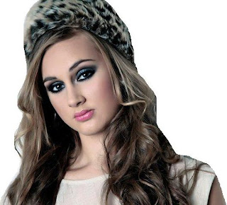
The postures of both women are similar in the fact that their heads are both slightly tilted where their eyes still capture the heart of the camera. They also have similar facial expressions where there is near to no emotion present in each of the front covers and has quite a serious tone, they seem to be more posed rather than smiling for the camera. Both women have similar hair styles and make up in each front cover. In addition, the costumes used in each front cover is quite simple where what the celebrity is wearing matches in with the colour scheme of each magazine. Adele is wearing red lipstick which relates to the well known colour scheme of Q magazine, where Lily Hudson is wearing pink lipstick which relates to the ongoing colour scheme of Swerve magazine as seen in the masthead. The mastheads are similar in the fact that they use a block of colour for the background of the name of the magazine, red is the colour scheme in Q so the colour is red, whereas in Swerve magazine the colour is pink so pink is the background. Both mastheads have the name of the magazine in white writing accompanied by this background. As well as this, both magazine front covers were taken with similar background settings - both pictures were taken against a plain coloured backdrop.

However the lighting used in the front covers varies, the lighting in Q magazine makes the background light up at the same time Adele is lit up, whereas the light is only on Lily Hudson which does not reflect on the background. The stance of Adele is different, where it looks as if she is hiding behind her hand, where Lily Hudson is boldly standing in the center of the frame. Overall, I believe these elements put together represents a normal, edgy, urban social group which I am presenting in my magazine which reflects throughout. The celebrities featured in my magazine are all of similar genres and who are quite normal looking - people you expect to see on a day to day basis, where there is nothing to extreme or obscure about their appearances.

Question 3. - What kind of media institution might distribute your media product and why?


Question 4. - Who would be the audience for your media product?

My target audience for my music magazine is 17-24 women. This is an appropriate age range for my magazine as it is the age range that is most influenced by music and the concept of it, therefore would appeal most to them. The audience would rather read about gossip and laid back but informative articles than serious stories, therefore my stories inside my magazine are light hearted and fun.  My target audience will read my magazine as it is about new upcoming artists which will interest them as the music industry is quite big right now, where music is very influential to teenagers and young adults.

Audience profiles

Name - Ellie Hood
Age - 18
Favorite music genre - Hip Hop
Favorite artist - Rita Ora
Hobbies - Shopping, fashion, photography
A link below is a song that Ellie is interested, the song is part of my genre of magazine therefore would be a story included in my music magazine. As a result, my music magazine would appeal to Ellie as she is part of my target audience. Both Rita Ora and Ellie dress like the models seen in my music magazine as they have an edgy urban feel to the way they dress.


Name - Dianna Saunders
Age - 21
Favorite music genre - R&B
Favorite artist - Chris Brown
Hobbies - Song writer, dance, art
Below is a link from a song Dianna likes, the artist is part of the genre included in my music magazine therefore it would appeal to her. From Dianna's interests and fashion, my music magazine would be the most suited to her as it includes aspects of which she likes. Chris Brown in the video is the prime example of a typical male in my genre that would be included in my music magazine from the way he dresses to his cheeky behavior.


Question 5. - How did you attract/address your audience?


Question 6. - What have you learnt about technologies from process of constructing this product?

By creating my music magazine I have learnt a lot about the technology used, the time given up and the processes that go into creating a music magazine. To create the overall product and blog I needed to use a number of different technologies such as a camera for my images, Adobe Photoshop to edit the images, an Apple Mac computer, the Internet for sites such as blogger, Slideshare and Prezi and Microsoft word.

The camera I used for my images was a Nikon D5100, I was not experienced in using the camera therefore I asked the help of my friend to teach me how to take images, zoom in and out and how to look back on the images I had taken. After a few practice images I was then confident in taking the images for my double page spread, as I was very familiar with the camera.

Before creating my music magazine I had never used the programmer Photoshop therefore it was not easy for me to start using, I had to take a lot of time to practice and learn all the different tools. From learning how to use Photoshop allowed me to be able to use all the tools I would need in order to create a music magazine for example I learnt how to cut the background off of images and edit the images for a brighter tone to the magazine as a whole.

The overall main technology I used was an Apple Mac computer, which is very difficult to use if you’re new to the idea, you have to use different applications in order to get a feel of how it works. Copy, pasting, cutting text and images are different on this computer than on a normal windows computer therefore was slightly difficult to start with. After I understood how to navigate around the laptop it was easy to use the laptop to create my music magazine.

I used the Internet in the process of creating my overall product for blogger, blogger was easy to understand and use which was helpful as this is where most of my content for my overall product will be situated. Slideshare and Prezi are websites, which I used on numerous occasions to show my work in an interactive way and both were easy to use. Although I found these websites easy to use I did have slight difficulty with working out how to get the presentations onto my blog, after researching I found how to embed the videos in order for them to be visible on my blog.

I feel like I have gained skills in using technology to create my music magazine. I am now more confident with using different applications and websites and am now not afraid to try different edits or positioning of photos in the future.

Below is a collage I have made of all of the technology I needed to use in order to create my music magazine.


Question 7. - Looking back at your preliminary task, what do you feel you have learnt in the progression from the full product?


Representation of men and women

Representation of men and women

Follow the above link to the video of the representation of men and women in my chosen genre.

Changes to my magazine

   Changes to my front cover of my magazine


This was my original front cover for my music magazine, but I had to change the background to a light grey colour so my overall product didn't look too feminine. There was a lot of the colour pink so by changing the background made it look more professional and sophisticated rather than young and girly. The change to the background also makes it look more edgy which goes with the theme and genre for my magazine. I also did a last minute change to my masthead, I believe it now stands out more and isn't hidden behind my model anymore. I think the masthead looks more like previous music magazines I have analysed therefore I believe changing my masthead was a good idea to do. I increased the brightness to my overall front cover where all the components now flow and feel like they merge together rather than looking like they have been placed on top of each other where it looks amateur, as shown in my previous front cover above.
My final front cover for my magazine is below.


---------

Changes to my contents page


This was my original contents page to start off with, I had sectioned off the feature stories and cover stories off from the regular stories in order to break the text up on the page. By doing so I had realized the attention either went straight to the images in the top left hand corner or the bottom right hand corner. The text did not seem as important that the separated images as I believed these were more attention grabbing in this layout. I decided to change the layout where I placed all the images on the left hand side of the page accompanied with all the text on the reverse side of the page. I think this layout was a good change to make where both the text and the images are not equally important rather than one being more attention grabbing than the other. My final contents page is below.


----

Changes to my double page spread


This was my original layout for my double page spread. From analyzing the work I had already produced and by asking my friends I was aware that there was quite an apparent gap between the text of my main story and the main image on the following page. I decided to extend my double page story where it follows onto the next page where the gap would be filled. I talked about her new album as well as the genre of it and the track list which is on the new album. As well as this, I decided to actually create an album for her where an image of the album would be part of the story which would promote the album as well as fill the gap in my double page spread. My double page spread now includes an inside story with Lily Hudson, as well as information about her album, her album track list and images of what her album looks like. This will be successful as it would make the audience recognize her album when looking in music shops or online. My finished double page spread is below.


Final magazine

My music magazine front cover


My music magazine contents page


My music magazine double page spread


Tuesday, 30 April 2013

Comparing institutions


The most evident similarity between NME and Q magazine would be the colour scheme used, both magazines use a colour scheme that mainly consists of black white and red but the main difference between the magazines is that NME has an informal layout whereas Q magazine has a formal layout. As a result this makes the magazines not look like each other although the same colour scheme is used.

Both magazines use well known celebrities where neither magazine have a set genre so each artist used on the front covers would not be from the same genre each week the magazine is published. 

Both magazines include the main codes and conventions in their magazines, which makes them successful, they both have a distinguished name and logo for their magazine as well as including a large main image of the artist, main story line, cover stories and flash news. These are used in order to show what is inside the magazine to get the reader to buy the magazine to read the articles.


Monday, 29 April 2013

Annotations & typography of front cover


The masthead of NME is bold and red, it is always placed on the top left hand side of the magazine. The colours used in the masthead are black, white and red which are distinguished colours that are always known to be related to NME magazine therefore is recognizable for the readers.
The main image used on the magazine front cover is not directly in the center of the magazine as it a little to the right of the thirds rule which makes the composition more interesting. Anchorage text is used many times on the front cover, it is text that are underneath the smaller images. This text attracts the readers to read the inside stories.
The main text on the front cover is "Broken man?" which entices the reader to read the story to go with the caption, this text is in a different colour to the rest of the text on the front cover, it is white text on a black background which makes it stand out.
In the flash news, it follows the same colour scheme although the colours used are mixed around meaning the white text on the red background can be found nowhere else on the front page.
the cover lines are are poisitioned either side of the main image which give an insight to what the other stories inside the magazine are about. these are not as imoportant as the main story, this is shown as they are smaller sizes and are not the main focus of the magazine front cover. the colours used are still part of the main colour scheme where they make the magazine as a whole look more professional and recognisable.


Monday, 22 April 2013

Layout draft for my music magazine

Layout draft of music magazine

Front cover draft


Contents page draft


Double page spread draft


This is my flat plan for what my magazine front cover, contents page and double page spread will look like. The language I will use throughout my magazine will be well spoken English, although not too formal that the reader will lose interest.

For my front cover, I decided for the main focus of the magazine to be a main picture of a single celebrity so the focus is solely on them and their story alone. I will also include inside and exclusive stories and little bits of information that can be found if you read inside the magazine. My masthead is big and therefore will stand out so it is eye catching to the audience, I will also include strapline, top and bottom strip and the barcode, date, issue number and price on my front cover which are the codes and conventions you expect to find.

On my contents page I will include pictures of the artists which relate with the stories I will have inside my magazine, which will be listed on my contents page. I will write the features of what you can find inside the magazine and the regulars which can be found inside every issue of my magazine. My main picture will be of my celebrity as they are the main focus of this issue of my magazine, I will put 'new album' next to the picture as well so it is clear that the artist is the one with the new album.

From researching double page spreads in magazines it is common to have one main picture of the artist on one A4 side of the magazine to gain the attention of the reader as it is a large image. I am doing this on my double page spread as it is a common feature used. On the left hand side of my page I will have the title of the article, followed by a quote from the artist, then the starting of the article in a larger bolder font, then I will continue the rest of my article below. Throughout my article I will have pictures of my artist and her album. My article will be an informative piece of writing about a new release of the album and where you can buy it etc. 


Wednesday, 27 March 2013

Photographs for music magazine

The photographs I have taken to be included in my music magazine

The following image is the main image for my front cover of my music magazine


Whilst creating my front cover, I have to slightly brighten this image and adjust the contrast, this was due to the fact that the writing around the image on my front cover could not be seen as it blended in with my models hair, therefore the editing I did made it possible for the writing to be readable. Although not a large edit to the photograph was done, it was effective enough that the writing is now readable. The edited image is below.


---
I originally started with a different image to be used for my contents page but had to take a new image as the first was not suitable. The image below is the image I had to change, it was taken with an artificial lighting to light up my models face.


This is the first image I used for my contents page, but after creating my contents page I needed an image of my model landscape to fit in with the rest of the images on my contents page rather than the image being portrait and not being able to fit it into my contents page. The image below is the new photograph I have used on my contents page, I took this photograph on the black and white setting on my camera with artificial lighting to give a more edgy vibe.


---

The following image is the image that can be found on the first page of my double page spread. In my double page spread story it talks about how Lily Hudson uploaded an image of herself onto twitter after finding out her album was number one in the UK, so I took a laid back image of my model in a dark setting with no editing to look like she had took the photograph herself from some sort of media device such as a laptop.


---

The following image is the main image for my double page spread and takes up nearly the whole A4 on the right hand side. This image was taken on the black and white setting to go with the colour scheme of my magazine. Unlike my other black and white image for my contents page, this one is done in natural sunlight and no colour editing was done to make my model  in order for my model to look more natural.


This was my original image, but for my double page spread I had to mirror the image so my model wasn't facing away from the article written about her. By mirroring the image makes it look more of a double page spread as it seems to flow.

---

The images I have used for my music magazine go with the main colours I have used for my magazine. Throughout my magazine I have had a black, white, grey and pink colour scheme. For my front cover image and webcam image on my double page spread, pink lipstick is worn by my model which makes it stand out from the other subtle colours of herself and what she is wearing. Also, on my contents page photograph and the main image on my double page spread I have took in the black and white setting on my camera. By taking my photographs with my model wearing pink lipstick and by making my images black and white go with the overall colour scheme which is seen throughout my magazine, this makes my magazine flow and look more professional as a whole.

Flat plans

Flat plan for my magazine
Flat plan for Q magazine


These are flat plans I have created for my own music magazine and Q magazine. For my music magazine I only have to create a front cover, contents page and a double page spread not a whole magazine as shown by my flat plan. My stories will feature on my double page spread.

I have analysed Q magazine and seen all the conventions they use to create a whole magazine, they use a mixture of singular articles, adverts, double page spreads and promotional images. The layout of Q magazine is mixed up, no double page spreads and continuously next to each other followed by pages of just adverts, they are all intertwined in order to make the magazine flow and that is it not boring for the readers. Towards the end of the magazine quite a few pages are used up for adverts, these are Q magazine promoting businesses that have paid them to include their business in their magazine, they have to go with the genre of the magazine in order to appeal to the certain audience of Q magazine.

Adverts are also used on the pages after the front cover which doesn't go with the stereotypical layout of a music magazine that goes straight into the contents page after the front cover, the contents page in this magazine is actually a double page spread layed out on pages 4 and 5. Promotional gifts are also offered such as a free CD is available with the magazine I brought, followed by an album review of the CD in order to promote it.


Thursday, 21 March 2013

Concept of magazine


The concept of my music magazine


Name of music magazine


I have thought of many names which I could choose to be my masthead of my magazine, which range from 'Flare' to 'Trendsetter.' The name for my masthead which I have chosen for my music magazine is 'Swerve,' this is a cool, down to earth name which would be appropriate for my target audience, and would also appeal to them to make them read my magazine.


Fonts 
The fonts I have gathered for my front page are of various types, to try them out and see what would go best with my masthead. I need to ensure when picking the font for my masthead that it goes with the genre of my magazine. The font I have chosen is 'Stenha' from dafont.com as it is trendy and edgy and goes well with the name I have chosen for my masthead.


Colours
Im going to use a range of colours in my music magazine, I will keep the usual black and white but will also include a splash of colour to make it more appealing, Ill use colours such as red, yellow, green and blue. This will make my front cover more bright and attention grabbing, therefore my target audience will want to read it.

Genre
The genre of my music magazine is R&B Hip-Hop, this genre is suited for my target audience as nowadays this is the most popular and main genre around. I am choosing this genre as it is most appealing to my target audience and will be of interest of them to read.

Features
The features I will include on my front cover of my music magazine will be the masthead, top and bottom strip, coverline and the barcode for my magazine, which also states the date, price, and issue number of the magazine, which is helpful to the reader. On my front page, I will also include the exclusive stories and inside stories which can be found inside my magazine, which will encourage them to read the stories in more depth. Although all these features are included in my front cover, the main focus will be on the main image I will use.

Stories
The main story inside my music magazine will be an album release from an already known artist. This artist will be the main image on my front cover, and will have a strapline to go with the image which explains who she is, what her new album is about and what it is called. The main focus throughout my magazine will be this new album release.


Reader profile and target audience 
My target audience is 17-24 women, so I will consistently use formal language so my music magazine appeals to them, although not too formal that is does not interest the reader. This age range would rather know about gossip and read fun articles rather than politics and serious subjects, so by making my music magazine have quite a relaxed, light hearted tone it would appeal more to my target audience.
My masthead, stories, images and straplines will all be of interest to my target audience therefore will persuade them to read my music magazine. My target audience will read my magazine as it is about new upcoming artists which will interest them as the music industry is quite big right now, where music is very influential to teenagers and young adults.


This is my flat plan for what my magazine front cover will look like. I decided for the main focus of the magazine to be a main picture of a single celebrity so the focus is solely on them and their story alone.
I will also include inside and exclusive stories and little bits of information that can be found if you read inside the magazine. My masthead is big and therefore will stand out so it is eye catching to the audience, I will also include strapline, top and bottom strip and the barcode, date, issue number and price on my front cover which are the codes and conventions you expect to find.


Mood Board

Mood Board 
R&B Hip-Hop Genre


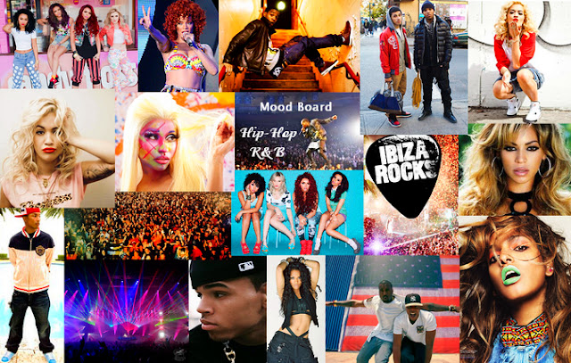
I have created a mood board for my chosen genre for my music magazine, I have chosen the genre R&B Hip-Hop. This is a suitable genre for my target audience as it is of interest to them, as this genre is popular nowadays. On my mood board I have included different aspects of this genre, which will help me whilst creating my own music magazine. 
I have put together a collage which includes various R&B Hip-hop artists such as Rita Ora, Rihanna, Beyonce, Nicki Minaj, Chris Brown, Little Mix, M.I.A, Kanye West and Jay Z.  
I have also included audience and setting images of concerts from these artists' performances, researched the R&B Hip-Hop fashion; of what people in this genre wear, and images of the concerts my target audience would go to/be interested in.
On my mood board I have covered the main aspects of my chosen genre, and this will thoroughly help me whilst creating my music magazine, this is because I have got a good insight to this genre which will help me to make sure mine is suited to my target audience. 

The representation of men and women in my chosen genre have quite urban characteristics in the clothes they wear and how they act, they are influenced by fashion and aim to stand out from other celebrities in the same genre as them. The representation of men and women is similar to that of the pop genre where in this genre they also are influenced by fashion and aim to be noticed for being a fashion icon.

The representation in the actual R&B Hip-Hop genre is mainly male dominated, from where my mood board shows images of Jay Z, Kanye West and Chris Brown, they are typically identified as being rich, owning very expensive jewelry, homes and cars, they are also shown to have either a lot of women or like Jay Z be married to another famous celebrity. In the media they are shown as having everything. Women in this genre are sometimes seen negatively, for example when they are portrayed in music videos they are seen not to be wearing too much and be the idea that they are objects for men to have and for them to look at. In contrast, when you see female music videos from the R&B, hip-hop genre they represent themselves how they wish to be portrayed, they do not live up to the representation as they are seen in male music videos but represent their personality as an artist. More and more women are being able to get into this genre of music as seen on my mood board, there are quite a few female artists. These women have had to stand up for their rights and to be heard in order to be taken seriously and respected by the already current male artists. As this genre of music is still increasing in popularity I believe the aspect of having many female artists are getting into the industry in order to break the stereotype portrayed by men and represent themselves.


My genre for my magazine is “hipster”, the models and the vibe of my magazine, as a whole will hold a strong edgy urban feel. The reader profile will be people who like this style and sense of fashion of which the images inside my magazine will appeal to them most.  Fashion is a bit part of my magazine therefore it has to be as representative of my audience as possible.


Story double page

Story for my magazine

Sometimes dreams really do come true - quote 
Power, pressure and expectations are my motivations 

Starter line - Chart sucess is on the cards for the American Dream Lily Hudson with the release of her debut album 'Power.'

First Draft


There's a new chart topper in town! RnB’s latest princess, Lily Hudson, as expected has hit the top of the charts this weekend as her debut album was released in the UK last Friday.

The American born, West London raised singer – who is signed to Jay-Z’s record label, Roc Nation – has already hit the top of the singles charts three times this year with the dancing track, ‘Can you party?’, her single ‘Unique’ (featuring Ke$ha), and current number 1 single ‘Outcome.’

Lily Hudsons’ debut album 'Power' is the number one best selling debut album in the U.K, it features singles alongside famous artists such as Drake, Will.i.Am and Nicki Minaj. The singer was playing in Philadelphia at the Made In America festival when the news that she had conquered the cards in the U.K came through the wire.


Lily Hudson certainly knows how to get a party started. The Roc Nation member's hit single “Outcome”  has been an instant addition to many fans' spring playlists, and she's hoping to carry that momentum into the summer from the release of her debut album, 'Power'. Swerve magazine recently caught up with Lily backstage at the radio one hackney weekend where we got a chance to interview the new star in town.

"Power has just been released, and I'm so excited about it," Lily said. "It took me two years to finalize this album, I'm now ready for people to hear it. It's a bit nerve wracking actually putting this album out. I've put so much work in, that I hope it pays off and will be of interest to the UK. We worked really hard, Roc Nation and I, we are happy to say that we are finally done and there's so many different types of genres on there."

Being included in Roc Nation carries some heavy responsibilities. With artists like Rihanna, J. Cole and of course Jay-Z, Lily realizes that even though she is in good company she still has a lot to prove due to being the 'new comer' in the group.
"Automatically being signed to Roc Nation gives you a platform, but it's all down to you from there," Lily said. "No one is going to get up there and sing for you or produce your music, you do that for yourself thats how you become successful. Push yourself as much as you're willing to put in. It's all good pressure and it gets people's attention, but you have to maintain their attention to be successful."

You may have watched Lily Hudson on stage at the hackney weekend concert and thought ‘OMG! I wish I could see her live!’ Well your prayers have been answered as Lily has just announced she is hitting the road. In celebration of her second single release 'Outcome' and her chart topping album 'Power' Lily will stage two exclusive headline shows with a performance at Hammersmith Apollo on 29 August 2013 and London’s O2 arena on 30 August 2013.

The new dates offer a chance to see Lily Hudson headline at venues following recent festival performances at Radio Ones Hackney Weekend. If her second single song title is anything to go by, her live show is bound to be a party! Tickets will be on sale Friday 22nd February 2013 from 9am.


Second draft 


There's a new chart topper in town! RnB’s latest princess, Lily Hudson, as expected has hit the top of the charts this weekend as her debut album (titled, ‘Power’) was released in the UK last Friday.

The American born, West London raised singer – who is signed to Jay-Z’s record label, Roc Nation – has already hit the top of the singles charts three times this year with the dancing track, ‘Can you party?’, her single ‘Unique’ (featuring Ke$ha), and current number 1 single ‘Outcome.’

The dazzling singer was playing in Philadelphia at the Made In America festival when the news that she had conquered the cards in the U.K came through the wire - it was evident that she was happy with the news from her once again outstanding performance! After that night, Lily posted a picture of herself on twitter with the caption "overwhelmed. absolutely ecstatic, thank you all." 

Lily Hudsons’ debut album 'Power' is the number one best selling debut album in the U.K, it features singles alongside famous artists such as Drake, Will.I.Am and Nicki Minaj. 

Lily certainly knows how to get a party started. The Roc Nation member's hit single “Outcome”  has been an instant addition to many fans' spring playlists, and she's hoping to carry that momentum into the summer from the release of her debut album, 'Power'. Swerve magazine recently caught up with Lily backstage at the radio one hackney weekend where we got a chance to interview the new star in town.

"Power has just been released, and I'm so excited about it," Lily said. "It took me two years to finalize this album, I'm now ready for people to hear it. It's a bit nerve wracking actually putting this album out. I've put so much work in, that I hope it pays off and will be of interest to the UK. We worked really hard, Roc Nation and I, we are happy to say that we are finally done, and it's an honest real album, representing me and my personality, and there's so many different types of genres on there."

Being included in Roc Nation carries some heavy responsibilities. With artists like Rihanna, J. Cole and of course Jay-Z, Lily realizes that even though she is in good company she still has a lot to prove due to being the 'new comer' in the group.


"Automatically being signed to Roc Nation gives you a platform, but it's all down to you from there," Lily said. "No one is going to get up there and sing for you or produce your music, you do that for yourself thats how you become successful. Push yourself as much as you're willing to put in. It's all good pressure and it gets people's attention, but you have to maintain their attention to be successful."

You may have watched Lily Hudson on stage at the hackney weekend concert and thought ‘OMG! I wish I could see her live!’ Well your prayers have been answered as Lily has just announced she is hitting the road. In celebration of her second single release 'Outcome' and her chart topping album 'Power' (released Friday) Lily will stage two exclusive headline shows with a performance at the Hammersmith Apollo on the 29th of August 2013 and London’s O2 arena on the 30th of August 2013.

The new dates offer a chance to see Lily Hudson headline at venues following her recent festival performances at the Radio One Hackney Weekend. If her second single is anything to go by, her live show is bound to be a party! Make sure you are there!

Tickets will be on sale Friday 22nd February 2013 from 9am.

The songs on the new album offer a chance to see Lily Hudson singing a range of different genres of music where you see her how you’ve never seen her before. 

The songs that feature on the album:

Album  


1. Can you party
2. From time to time
3. Outcome
4. Unique 
5. The beginning
6. Heartbeat
7. Shooting stars
8. Wild side
9. Blush
10. Trouble
11. Ripped Apart
12. Vibe
13. Closer